
CARROT
Based on my experience setting and planning against goals, I created an independent challenge to design a digital experience that will help set up and track goals for people who are new to the concept of quantifying goals and tracking commitments.

Background
In January, I set a list of goals that I wanted to accomplish for the year (one of them is to finish up my portfolios within the first quarter of the year). I began to do some research for available products already on the market that could help me set up my goals and track the progress.
It took me while to understand the concept of first quantifying my goals and then tracking my progress - apps like Beeminder, StickK, Strides, and Push help do this. Once I figured out the process and my preferences, I started and followed through on new habits, projects, and routines more successfully than I ever had before.
However, the problem I found with the current goal setting apps is that it is so difficult to stay engaged. Every year people set important of goals and are enthusiastic about accomplishing them for a few months, but ultimately end up losing focus and letting go. I would like to improve this process and design an experience that help users to stay focused and engaged all the way through accomplishing their goals
Research Methods
To research, I utilized marketing materials, conducted competitive analyses, user surveys and read user reviews in the app store and by bloggers of other apps currently in the marketplace.
Interviews
In order to understand users and gain some insights, I interviewed people who are professionals under age 25-35 and work in corporate jobs. They are both very busy and also aspirational towards their personal and professional lives.
Then, I had in-person interviews that lasted 30 minutes to an hour. Questions covered how users came up with their goals, how they built new habits, how do they commit, how do they keep track of their progress, how do they determine penalties if they fails to achieve those goals, and if they have ever done any habit challenges.
Below are some of the quotes from interviewees:
“I’m trying to break my long term goals in to short time periods. For example if I want to accomplish my career goal, I will break things that I have to do and evaluate them every 3 months”
“I don’t want to call it a New Year Resolution because It sounds like more of a commitment. I see it as one of my goals so I have more flexibility on when and how I want to complete it”
“My goal this year it to focus on my health and exercise. I want to be able to do a head stand yoga post without using any wall support. As time goes by, I feel it’s difficult to practice and I feel discourage to go on practicing.”
“I used to use habit builders/habit trackers apps. The in-app notifications kept me engaged for a short period of time. Inevitably, I feel it’s easy to ignore all of those notifications that pop up on my screen. Sometimes I ever feel that it’s annoying and I want to opt-out them.”
Here are some of the key insights:
Users care about small goals that can be accomplished in the short term and still keep them motivated
Sometimes, they are looking for an accountability partner, someone who can help pushing and verify if they are making progress
They also looked for feedbacks or mentors to help guide them
Based off of those key insights I developed three personas to focus on through the design and concepting phases.
User Personas
I developed 3 personas to help me wrap my head around user flows and features afterwards. Below is a quick description of user personas:
Those who are risk takers and want a hard commitment on their goals. They also need a high-risk-high-return type of motivation.
Those who need supporters or peers who can help supervise, cheer up, and push one to another
Those who look for small steps to make small accomplishments, which count as rewards for themselves.
How Might We’s (Brainstorming)

Competitive Analysis
There are three types of products — Committed Devices, Helpful Limitations, and Feedbacks and Reports — that provide systems for brain and habit training. Some of them are available in both webpage and mobile application formats, however few of them are designed primarily for desktop users. Below are examples and details of products from each category.
Category1: Committed Devices
Beeminder allows users to commit to their goals submitting a quantifiable goal and putting in money to stay accountable. If you go off track, you get charged. The platform is very data heavy and users can link the site to different online productive tools
StickK is similar to Beeminder but less data focused. It allows users to commit their goals by creating stakes or consequences in case users fail to complete the task. Users can allow supporters to watch progress and referees that will receive an email anytime that users log their journal.


Stride app embraces the Seinfeld strategy by having a visual reminder that shows and encourages users to keep their streak. An easy visualization streak motivates users who don't want to tarnish their own success. The user can also create a goal for their streak. For example, you can set 30/90 day streak goals. This feature helps users create challenges on their goals that become more official.
Category2: Helpful Limitation
In this category, the platforms will be mainly Website and application blockers and Pomodoro timer apps. These apps help users to block anything that is distracting on a daily basis. Some apps provide a universal dashboard that go to different devices to help the user manage their preferences on different devices.
Freedom (Site Blocker)
Pomodoro Timer app
Forest Timer app
Category3: Feedbacks and Reports
This type of app will show users a detailed breakdown of what they’ve been doing with their time. There are both manual and automatic time trackers available. These kinds of apps won’t force users to commit to anything. Instead, they will help you realize the time that you spend on certain activities.

Toggle
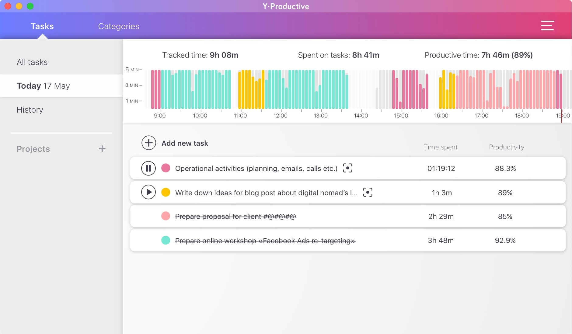
Y-Productive
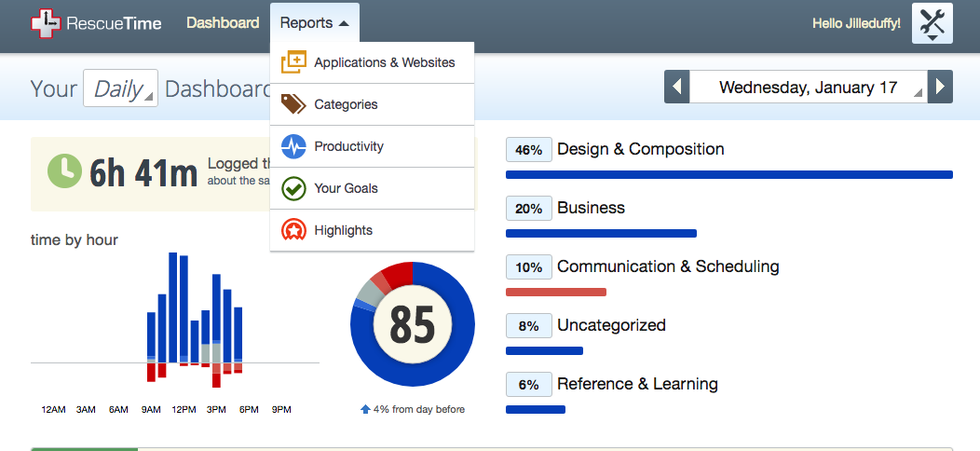
Rescue Time
Clockify
Approach
My approach is to design a responsive website that enables users to create their goals and commitments, as well as log and visualize data to help track their progress and performance. I chose to design a responsive website because I’ve learned that users are most likely to be in front of their computer in their office during the day. So having a site that is easy to access and quickly input data is ideal. Users may occasionally use their phones or tablets for this purpose, such as when they are on the train.
User Flow
After finalizing my user personas, comparable problems, and doing a first round of initial sketches, I began working on the user flow. I set forth to design a journey for existing shareholders who are already subscribed to the service and already have placed an order for the first time through the mobile app. Based on their schedules and information in the system, I started wireframing the user flow.
I focused on building flowcharts that linked the most critical functions first. For example, this is an early flowchart that connects signing up to starting your first goal:

Wireframes
Wireframes are a skeleton view of the site, or as I like to call it the, bones. This allows me to focus on key functions, elements, and actions before starting on visual design or putting on any skin. I started off with a quick hand sketch in my notebook to see if I could see how each function would navigate between pages. I worked outward until I had all the functions mapped and each of the sequences interlinked.


High Fidelity Wireframes
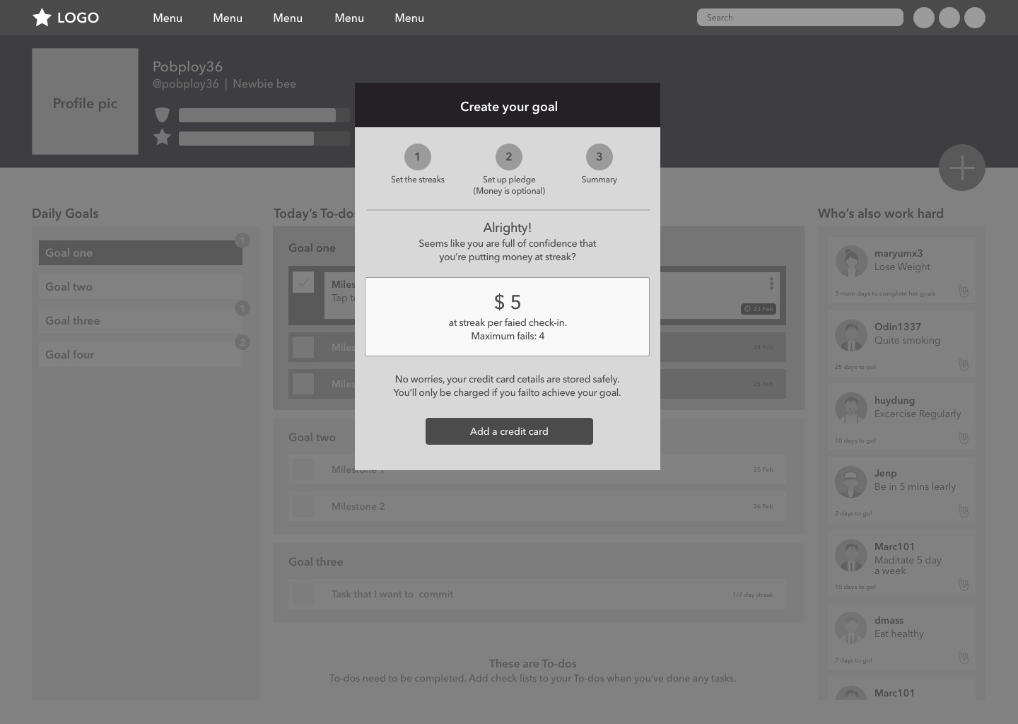
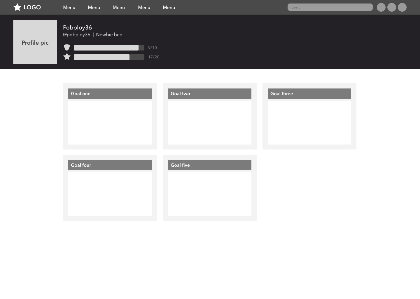
Once I had an overview of how everything was going to fit together, I began to lay out the most important elements for each of the screens. I opted for High-Fidelity wireframes to add some color and place images and icons.
Initially, there were three types of screens I wanted to lay out. The first was the “Main screen”. The second screen was the “Dashboard screen,” where users can see visualizations of their progress. The last screen was a “Goal screen,” where people spend most of their time when they are logging their progress for each goal.
Then there were the transition screens. Anything that is part of a process, such as signing up, setting up a goal, connecting your card, etc.
People spend more and more time on settings pages as they transition from beginners to regular users. The idea was to distinguish them from the main pages and but still make them easy to follow.


Logotype
I wanted an obvious name but also a significant logo, so Carrot was the best choice for the name. I was thinking that a “Carrot and Stick approach“ could be a good analogy for the concept and goal of my site. I then crated a logo and after some iterations I came up with a logo combining the word carrot with an actual carrot hanging at the end of letter T.

Color Scheme
I went for a carrot-like color scheme to help bringing the brand identity to life . Bright colors create an energetic look and feel. Also, orange is a color that triggers attention and a sense of urgency.

Typography
Most of what you see on a screen is type. Type is in the content, navigation, buttons, headings, and everywhere else. Given how much space words occupy, I worked on selecting the typefaces before I got involved in designing the individual components.
The display font I selected is Raleway Bold. I wanted a typeface that was indistinguishable from the old logo typeface. Of all the options shortlisted, Raleway letterforms had the most space inside the letters, making it the most readable.
The display typeface was for headers, titles and buttons. At first I paired it with Raleway Medium as a body typeface. I needed something that matched the display font but was also legible at small sizes and in large blocks of text.

Next Steps
Usability Testing
Test the prototype with users. My personal favorite for usability testing on prototypes is Maze.Design it’s easy to use and offers comprehensive data on your prototype.Wireframe for mobile and tablet screens
I plan to create low fidelity screens for mobile and tablet resolutions after the testing process were stabilized
Iterate
Take the findings from the usability test and iterate upon the design, then improve the user flow.Visual Design
With the wireframes set, the typography decided, the components designed and the color in place, the last step is to finalize each of the webpages.
Final Thoughts
It’s so hard to stay motived. Most of us will give answers like “I don’t have the time, my life is busy", or we’re pulled to different directions from friends, family or career.” But an unexpected discovery is that motivated people and demotivated people see things in different world. Motivated people see goals closer than non motivated ones.
There is no one easy answer to the quest of how to stay motivated. I just want to offer a tool box that provides a variety of different techniques that might work. Thus, the users have more strategies available that they can use at the right time and the right place.
In term of design, branding and storytelling, this helps the experience become more robust and can build a stronger connection between users and product.